A great color palette shapes the atmosphere of any visual project. Whether you're going bold and vibrant or soft and muted, colors play a major role in creating emotional impact. But building a perfect palette can often turn into endless tweaking of hue, saturation, and brightness.
To speed things up, and make the process more fun, here are five of the best free color palette generators on the internet. From creating palettes from images to exploring curated color inspiration, these tools help streamline your workflow and unlock fresh ideas.
5 Best Free Color Palette Generator Tools
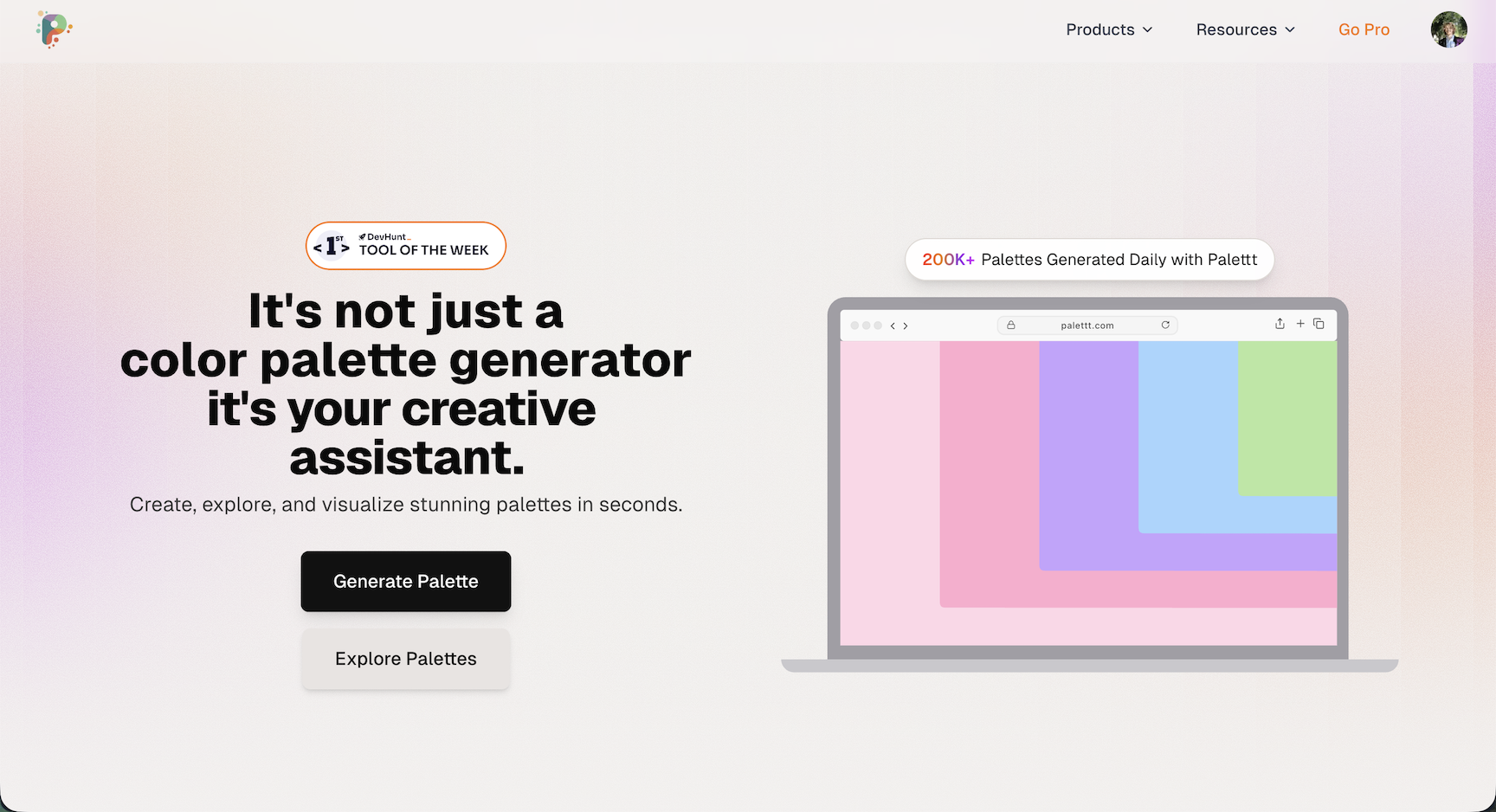
01. Palettt
Palettt is a modern color palette generator that combines simplicity with powerful features. Upload any image and watch it analyze every pixel to extract a perfectly balanced color scheme, or generate fresh palettes with a single click until you land on something that sparks your creativity.
What sets Palettt apart is its thoughtful workflow. Fine-tune individual colors, lock your favorites, and rearrange them with drag-and-drop ease. The palette history feature lets you step backward or forward through your creative process, no more losing that perfect combination you saw three iterations ago.
For developers, Palettt offers seamless export options: copy as Tailwind config, CSS variables, JSON, or SVG with a single click. The built-in contrast checker ensures your palettes meet accessibility standards, while collections keep everything organized by project or mood.
Whether you're designing a brand identity, building a website, or creating social media graphics, Palettt makes it effortless to create, refine, and export beautiful color schemes.
02. Coolors
Coolors is one of the most popular palette tools for a reason: it’s fast, straightforward, and surprisingly powerful. Pressing the spacebar instantly generates a new five-color scheme, transforming your screen with fresh combinations until you discover one that fits your vision.
Hover over any color to explore options such as finding similar shades, adjusting hue/brightness, rearranging their order, or locking colors while generating new ones. Coolors also supports image-based palette extraction and features like gradients, trending palettes, and numerous export options.
With its dedicated mobile app, Coolors becomes a must-have for designers wanting inspiration on the go.
03. Adobe Color
Adobe Color is a professional-grade platform for building detailed and harmonious color themes. Start by exploring thousands of community-made palettes, filtered by trend, popularity, and recency. When you find one you like, you can customize every aspect in the Color Wheel workspace.
Adobe Color lets you adjust RGB, CMYK, and other values while applying harmony rules like analogous, complementary, and monochromatic. You can also set a “Base Color” to build variations that maintain balance. Accessibility tools help ensure your palette works for all audiences.
The “Extract Theme” feature generates palettes from any image you upload, making it ideal for brands and designers who want inspiration grounded in real-world visuals.
04. Khroma
Khroma is unlike any other palette generator, it uses AI to learn your personal taste. When you first visit, you’ll be asked to pick 50 colors you love. Although it may take a few minutes, this step trains the algorithm to understand your aesthetic preferences.
After that, Khroma creates endless combinations in several formats: color blocks, gradients, typography previews, and four-color palettes. The scrolling interface feels like browsing a curated feed designed just for you.
Pair Khroma with a basic knowledge of color psychology, and you’ll have a powerful tool for building emotionally resonant designs.
05. Color Hunt
Color Hunt provides a massive gallery of beautiful, hand-curated palettes. Unlike algorithm-generated results, each palette is selected for visual appeal and usability, making the site a great source of inspiration for branding, web design, and social content.
Browse trending, popular, or new palettes, or filter by color styles like pastel, vintage, vibrant, earthy, and more. Every palette lets you instantly copy hex codes or view individual colors for quick access.
It’s a perfect mood-board companion for designers who want fresh, stylish color ideas.
What to Look for in a Good Color Palette Generator
The right palette generator can make your design process smoother and more enjoyable. Start with ease of use, good tools help you quickly build balanced palettes without navigating complex menus. Look for accessible interfaces with draggable elements, sliders, and instant previews.
AI-powered features are especially valuable. Tools like Khroma and Palettt use machine learning or intelligent extraction to produce palettes based on your preferences, images, or keywords. These help spark creativity and save time when starting a new project.
Exporting is another key feature. Great generators let you copy hex values instantly, download palettes as CSS or ASE files, or sync with tools like Figma and Adobe XD. Accessibility tools, especially contrast checking, are essential for inclusive and readable designs.
How to Pick a Color Palette
Choosing the right color palette is a key part of shaping your project’s visual identity. Here’s a simple step-by-step process to help you build a palette that supports your design goals:
Define your purpose and audience: Start by thinking about your project’s intention, the feeling you want to evoke, and who will be experiencing your design. What emotions should the colors communicate?
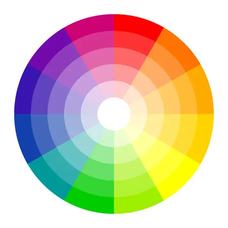
Learn basic color theory: Understanding primary, secondary, complementary, and analogous colors, as well as the color wheel, will help guide your choices and keep your palette visually balanced.
Look for inspiration: Explore examples from nature, photography, branding, films, or art. Create an inspiration board with visuals that represent the style or atmosphere you want to achieve.
Think about color psychology: Colors influence emotion. Red suggests passion or intensity, while blue feels stable and calming. Understanding these associations makes your palette more meaningful.
Try different color schemes: Experiment with monochromatic, analogous, complementary, triadic, or tetradic combinations. Adjust saturation, contrast, and the ratio of each color until you find the right balance.
Review your selections: Test your palette inside your actual design. Does it create the mood you want? Does it match your brand or purpose? Refine it until everything feels cohesive.
Get feedback: Share your palette with others. A second perspective can help you catch inconsistencies or identify areas that could be improved.
Finalize your palette: Make final adjustments after reviewing feedback and testing your palette in different scenarios.
Additional Tips for Choosing Colors
- Use palette generators to quickly visualize different ideas.
- Keep accessibility in mind, ensure contrast is high enough for readability.
- Preview your palette across different screens and lighting conditions.
- Experiment freely, creative exploration often leads to the best results.
How Many Colors Should a Palette Include?
The ideal number of colors depends on the style and complexity of your design. These general guidelines can help:
For simple, elegant layouts, a monochromatic or analogous palette with 2–3 colors often works best. These palettes feel cohesive and calming.
If your design requires more contrast or visual energy, use 4–6 colors in a complementary, triadic, or tetradic arrangement. These schemes help create dynamic, engaging compositions.
- Monochromatic (1–2 colors): Ideal for minimal, clean aesthetics.
- Analogous (3–5 colors): Great for soft, harmonious looks.
- Complementary (2 colors): High contrast and bold energy.
- Triadic (3 colors): Vibrant and balanced designs.
- Tetradic (4 colors): Rich, dynamic, and versatile palettes.
How to Create Your Own Color Palette
Begin by identifying your brand’s personality or the message behind your project. Pick a main color that captures this feeling, then test combinations that support it, whether that’s contrasting hues, neighboring colors on the wheel, or different tints and shades.
Aim for a clear hierarchy: a dominant color, a supportive secondary color, and a distinctive accent shade for highlights and buttons. Make sure your text stands out clearly, whether you're using dark-on-light or light-on-dark combinations.
Check your palette on different screens to ensure consistency. Use accessibility tools to verify readability for users with visual impairments. The more you test, the more polished your final palette will be.
Looking for more color ideas? Explore these guides:
Try Palettt Today
Create, refine, and export beautiful color palettes in just a few clicks.
Start using Palettt →