Welcome, future design guru! Have you ever wondered why some websites just feel right, while others are jarring or confusing? Often, the secret lies in one fundamental principle: color theory. As a UI/UX or web designer, understanding how colors work together isn't just a nice-to-have skill—it's essential. This beginner-friendly guide will demystify the color wheel, explain color psychology, and equip you with practical tips to create stunning, effective digital experiences.
🎨 What is Color Theory and Why It Matters for Designers?
At its core, color theory is a set of principles for mixing colors and understanding the visual effects of color combinations. It explains how humans perceive color and how designers can organize and apply color effectively.
Why It’s Crucial for UI/UX and Web Designers
Color is more than decoration. It’s a communication tool:
- Aids navigation and guides users’ attention.
- Establishes brand identity (trust, energy, elegance).
- Ensures readability and accessibility with proper contrast.
- Evokes emotion and sets the tone for your design.
🌈 The Foundations of Color: The Designer's Toolkit
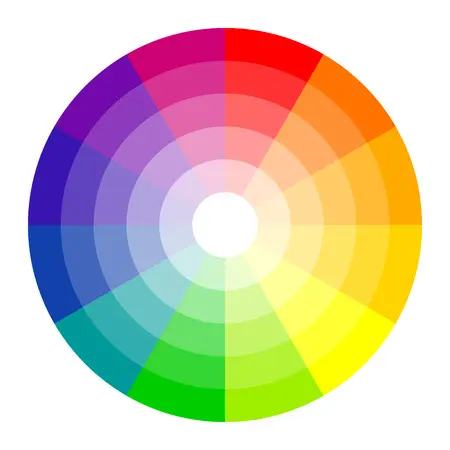
Every design begins with understanding how colors are classified and organized. The color wheel is your guide.
The Color Wheel
An organized map of hues that helps designers mix and contrast colors effectively.
Color Categories
- Primary: Red, Yellow, Blue — the building blocks of all other colors.
- Secondary: Green, Orange, Violet — made by mixing two primary colors.
- Tertiary: Mixing a primary with an adjacent secondary color.
Understanding HSL
- Hue: The pure color on the wheel.
- Saturation: The intensity or vibrancy of the color.
- Lightness/Value: How light or dark a color is.
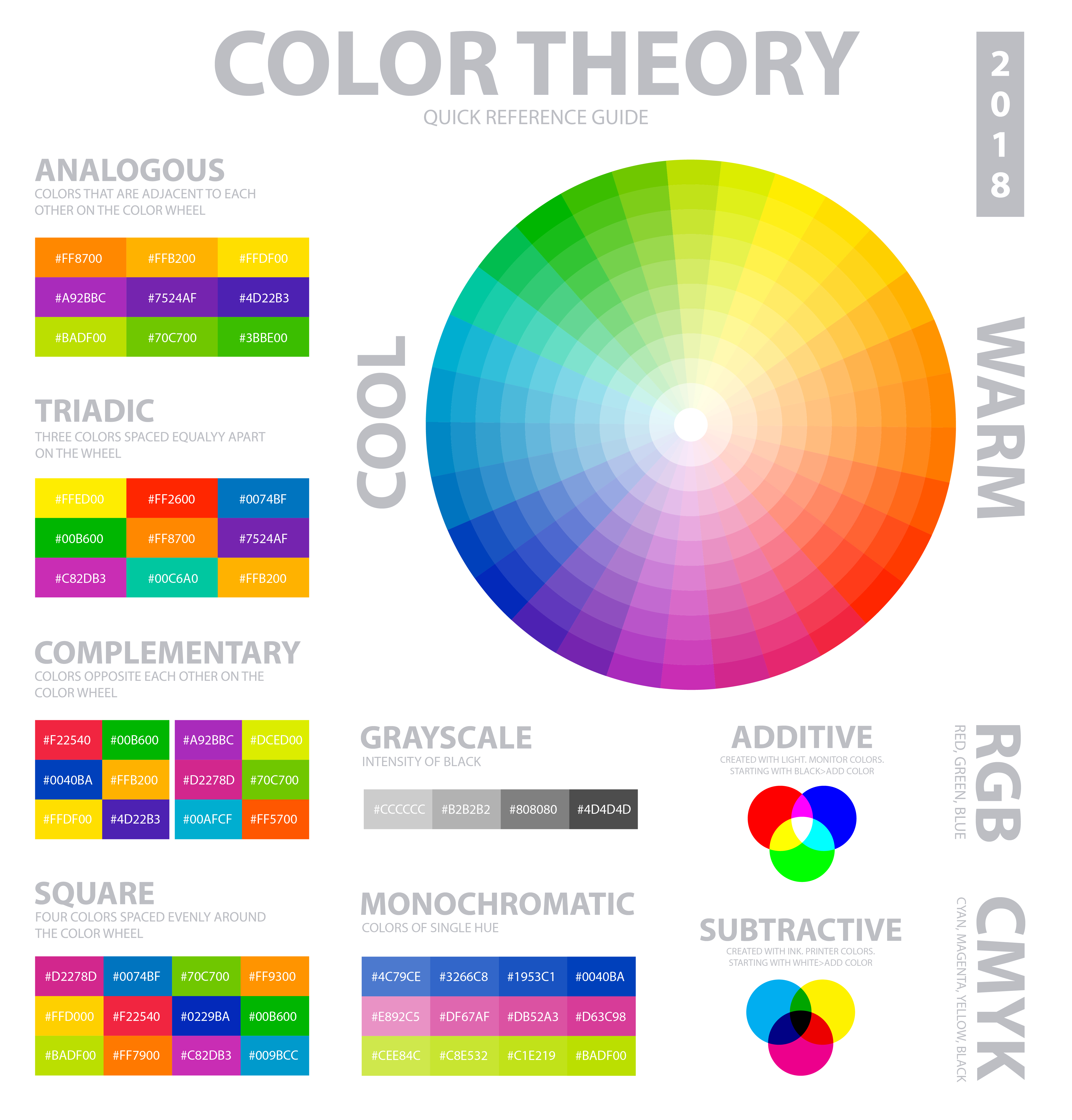
🔗 Mastering Color Harmony
Color harmony is the art of combining colors in visually appealing ways. Common schemes include:
- Complementary: Colors opposite each other — high contrast for CTAs.
- Analogous: Colors next to each other — smooth, cohesive look.
- Triadic: Three evenly spaced colors — bold yet balanced.
- Split-Complementary: Base + two adjacent to complement — high contrast, easier to manage.
- Monochromatic: Tints, shades, and tones of one hue — subtle and elegant.
🧠 Color Psychology
Every color carries emotional and cultural associations that influence perception and brand trust.
| Color | Associations | UI Use |
|---|---|---|
| Blue | Trust, Security, Stability | Finance apps, headers, backgrounds |
| Red | Energy, Passion, Urgency | CTAs, Alerts, Warnings |
| Green | Growth, Health, Calm | Success messages, Buttons, Environmental brands |
| Yellow | Optimism, Creativity, Attention | Highlights, Accents, Low-level warnings |
| Black | Luxury, Power, Sophistication | Typography, High-end brands |
🛠️ Practical Design Tips
The 60-30-10 Rule
Use 60% dominant, 30% secondary, 10% accent colors for a balanced design.
Accessibility (Contrast)
Ensure readable contrast between text and background using WCAG standards.
Context is Key
Colors mean different things in different contexts. Use them consistently.
🌐 Real-World Color Examples
Spotify (Analogous Scheme)
Vibrant green with black and white creates energy and recognition, while remaining harmonious.
PayPal (Monochromatic/Blue)
Shades of blue convey trust and stability, differentiating buttons, headers, and text effectively.
🎉 Conclusion
Color theory is the language of design, guiding users through your product and influencing perception.
Put these tips into practice! Experiment with complementary, analogous, and triadic schemes to find the perfect palette for your next project.
🌈 Start creating your own palettes at palettt.com