Welcome to the fascinating intersection of human emotion and digital interfaces. As a UI/UX designer, you are not just painting pixels. You are influencing moods, guiding decisions, and building trust. The secret tool in your design toolkit is color psychology. This is not just about aesthetics. It is about strategically leveraging the emotional and cognitive impact of colors to create effective and intuitive user experiences.
In this beginner-friendly guide, we explore what colors communicate, how they affect user perception, and provide practical tips for making color choices that enhance usability and drive successful outcomes.
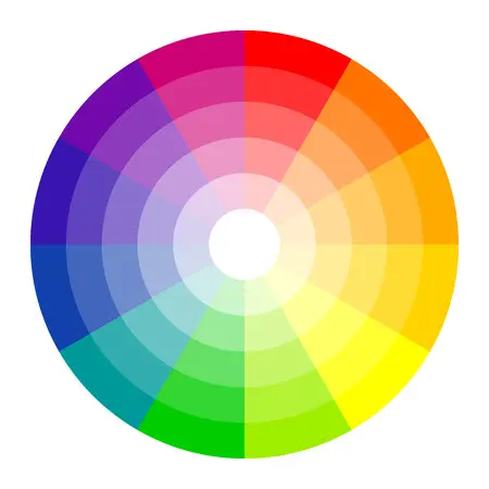
Understanding the Emotional Power of Color
Every color carries cultural and evolutionary associations. Our brains process colors instantly, linking them to learned associations, cultural norms, and primal instincts such as seeing red for danger or green for safe food. In design, understanding these associations allows us to craft interfaces that feel natural to users.
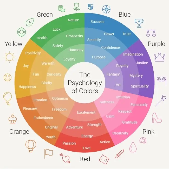
Blue: Trust, Security, and Calm
Blue is one of the most popular and safe colors in UI/UX design. It is associated with the sky and sea, conveying stability, wisdom, and confidence.
- Application: Ideal for financial institutions, social media platforms, and tech companies. Excellent for primary navigation and corporate branding where trust is important.
- Caution: Very dark blue can feel distant or cold. Brighter shades feel more modern and friendly.
Red: Energy, Urgency, and Warning
Red is a high-intensity color. It attracts immediate attention and is linked to passion, excitement, danger, and caution. It works well as an accent color.
- Application: Best for high-priority call-to-actions, error messages, and immediate warnings.
- Caution: Use sparingly. Too much red can cause visual fatigue and suggest constant alarm.
Green: Growth, Success, and Nature
Green represents health, renewal, prosperity, and the natural world. It is commonly associated with success and positive actions.
- Application: Used for success notifications, positive feedback, environmentally friendly brands, and financial interfaces related to growth.
- Caution: Shade matters. Deep green suggests luxury, while bright green feels youthful or health-focused.
Yellow: Optimism, Clarity, and Attention
Yellow is associated with joy, friendliness, and energy. It is highly visible, making it ideal for highlights.
- Application: Suitable for subtle warnings, highlighting important content, and branding that aims to feel cheerful or creative.
- Caution: Light yellow on white provides poor contrast and should be avoided for text.
Black and White: Sophistication and Simplicity
Black and white are essential for contrast, hierarchy, and mood.
- Black: Conveys luxury, power, and sophistication. Common for primary typography and premium brands.
- White: Represents simplicity, cleanliness, and minimalism. Provides breathing space to prevent cluttered interfaces.
Summary: Color Psychology and UI Use Cases
This table summarizes the core psychological meanings and practical applications of key colors in digital design:
| Color | Core Psychological Associations | Common UI/UX Use Cases |
|---|---|---|
| Blue | Trust, Security, Stability, Professionalism | Primary buttons, links, corporate branding, finance apps |
| Red | Danger, Urgency, Energy, Passion | Error states, delete buttons, high-conversion CTAs |
| Green | Success, Go, Health, Growth, Money | Success messages, confirmation screens, positive data charts |
| Yellow | Joy, Warning, Optimism, Creativity | Highlights, secondary warnings, accent for creative industries |
| Orange | Friendliness, Enthusiasm, Youth, Energy | Subscription sign-ups, engaging CTAs |
Practical Design Tips for Using Color Psychology
Theory is nothing without application. Follow these principles when using color psychology in your designs:
1. Prioritize Accessibility and Contrast
Colors must be legible. Ensure high contrast between text and background colors, especially for red and green. Color should enhance meaning but never be the only indicator of information.
2. Respect Cultural Context
Color meanings vary across cultures. White represents purity in Western cultures but symbolizes mourning in many Asian cultures. Research cultural associations before finalizing a global color palette.
3. Use the 60-30-10 Rule for Harmony
The 60-30-10 rule helps maintain visual balance:
- 60% Dominant Color (neutral or primary brand color)
- 30% Secondary Color (supporting brand color)
- 10% Accent Color (high-impact psychological color reserved for CTAs)
4. Use Tints and Shades to Control Emotion
Bright, saturated colors feel intense, while muted shades feel sophisticated. Pastel colors feel friendly and light, while deep tones feel serious and authoritative. Adjust saturation and brightness to fine-tune emotional impact.
Conclusion: Design with Intention
Color in UI/UX design is a language and psychology provides the grammar. Mastering the emotional impact of colors allows you to create intentional, user-centered designs. Every color choice should enhance usability, reinforce branding, and guide the user's journey effectively.
Start exploring color psychology in your designs at palettt.com